Portfolio
Google UX Certification
Customer Loyalty App for a Cafe
I completed this project for my Google UX Certification Program. This is an end to end UX project, starting from user research to high fidelity prototyping.

Project Overview
This customer loyalty app focuses on an easy and quick way to earn and redeem rewards at a local cafe.
User Research
I conducted user interviews and created a survey to better understand the users and what their goals and frustrations are when using customer loyalty apps.
Interview Questions
-
What is your experience like when you use a rewards app?
-
What challenges or dislikes do you have about rewards apps?
-
What makes the process go smoothly when using a rewards app?
-
What features do you enjoy in a rewards app?
Quotes from participants
“They usually have a pretty poor user design and don’t add a lot of unique value. 9/10 times I would rather just use a mobile web browser”
“Keep it Simple.”
“I need all of the info on the screen”
“Dont like expiring rewards”
“I need easily application navigation, most rewards apps don’t have that”
User Research Takeaway
I initially believed that the main concern of users was the amount and quality of rewards earned in app, but the survey quickly revealed that they actually had a much wider variety of goals and frustrations. These included issues like expiring rewards, confusing navigation, and useless features.
Pain Points
Pain points are problems that occur at the different levels of the customer experience.

User Research helped me identify these 4 key pain points in popular rewards apps
Personas
A persona is a fictional character that represents your target users. They are created by conducting user research and identifying pain points. For this project I created two primary personas.


User Journey Map
To further empathize with the users I created a User Journey Map for the Matt persona. A user journey map is a diagram that visually illustrates the user flow through your product.

Matt’s user journey was helpful to reveal that there are many more useful features than just rewards for a Cafe customer loyalty app
Goal Statement
Our customer loyalty app will let users earn rewards quickly and easily which will affect users who want to save time and money by letting users scan a personalized QR code when ordering.
We will measure effectiveness by the amount of rewards earned and redeemed.
User Flow
I created two different task user flows in figjam to visualize how users will move through the app.


Paper & Digital Wireframes

A few paper wireframes

Digital wireframes in Figma
Low-Fidelity Prototype


Usability Study
To test how potential users will react to my design I conducted a remote usability study. I provided participants with the low fidelity prototype and had them complete several tasks.

Affinity Diagrams
After collecting the data from my usability study I organized the participants comments and observations into an affinity diagram. This helped me identify common themes so I could define the problems in the product.

Research Insights & Recommendations


After reviewing the research insights and recommendations I highlighted what my next steps would be
-
Implement a more detailed deals program
-
Further update the rewards timeline to limit confusion and to provide a visual aid for the number of points collected by the user
-
Reassess the rewards system to continue to limit confusion by the user
Refining the Design
To take the next steps, I updated the user flow and low fidelity wireframes. I deleted the rewards store because it caused confusion and replaced it with a list of available rewards.

Updated Wireframes
Refining the Design
Colors
I was originally going to use several shades of brown and a green accent for the color scheme. I decided to go against this because it felt to literal and overdone. After some color research, I chose to use different shades of blue for the color scheme for a few reasons.
1. The color blue is often linked to creativity, which helps generate ideas even under pressure.
2. The color blue can boost productivity due to its relaxing and mentally stimulating effects.

Typography
Avenir Next is an iconic sans-serif typeface and a system font with macOS and iOS.

Iconography
I wanted simple, solid, and rounded icons, so I made these in Illustrator. I originally wanted to use unfilled icons but they felt lost on the finished mockups.
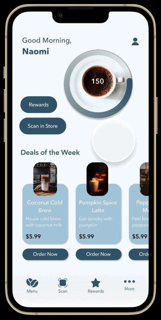
High Fidelity Mockups
I used the style guide to create high fidelity mockups. I also removed the deals list on the rewards page to avoid unneeded repetition.


High Fidelity Prototype

Conclusion
I had a lot of fun doing this project and thoroughly enjoyed the certification course. I’ve done UX projects before but for this project I got to go more in depth with the UX process. I got a lot better at practicing empathy with the user and doing ux research. In the future I would like to add to this project, I will add a menu and a preorder process.